Self-Registration is where visitors are allowed to enter their own details before they arrive, instead of an operator typing everything at reception. This page turns the public form on, produces the links and QR codes that lead to it, decides what the form asks for, and controls how the resulting requests behave.
Open it via Configuration > Visitor Settings > Self-Registration. The settings are split across five tabs listed on the left. Work through them in order the first time: nothing else matters until the General tab has the form switched on.
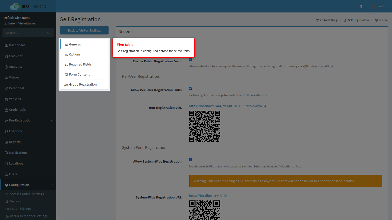
| Tab | What it decides |
|---|---|
| General | Whether the public form exists at all, and which links lead to it |
| Options | How registrations behave: location choice, delegates, students and minors, language |
| Required Fields | What the form asks the visitor for, including your own custom questions |
| Form Content | The wording and styling the visitor reads |
| Group Registration | Whether one person may book a whole group, and how members are handled |
Each tab saves on its own. Changing something on Options and then moving to Required Fields without saving loses the change.
Required fields are not custom fields. The Required Fields tab switches the product’s own, built-in fields (name, ID number, photo, vehicle plate) on and off. Custom Fields, at the foot of that same tab, is where you add entirely new questions of your own. If the information already has a name in the built-in list, tick its checkbox; if it does not, add a custom field.
General tab
Public Form
The master switch. Every link on this page, and every location link, is dead while it is off.
Step 1: Find the switch. On the General tab, the first section is Public Form and its single control is Enable Public Registration Form.
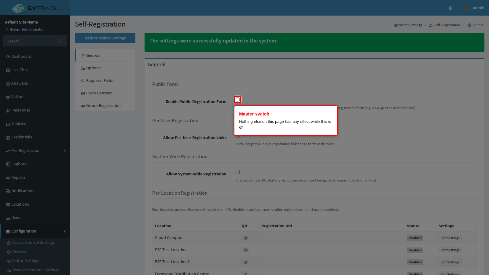
End state: you can see whether self-registration is currently on or off for the whole system.
Step 2: Tick the switch and save. Ticking it changes nothing until the tab is saved. Save sits at the bottom of the form; Cancel next to it discards your changes.
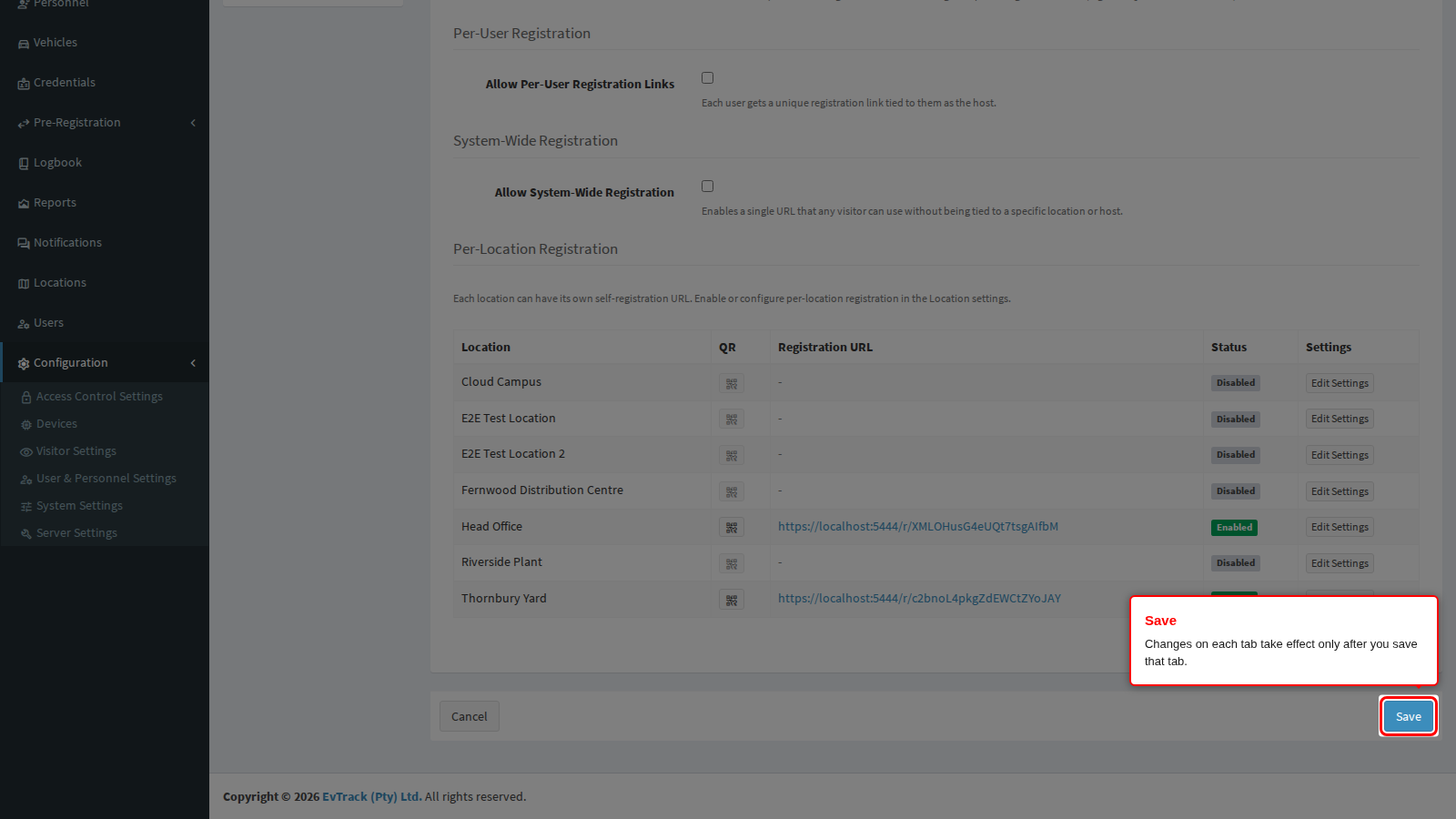
End state: the page reloads with the switch ticked.
Step 3: Confirm. A green confirmation appears at the top of the page after a successful save.
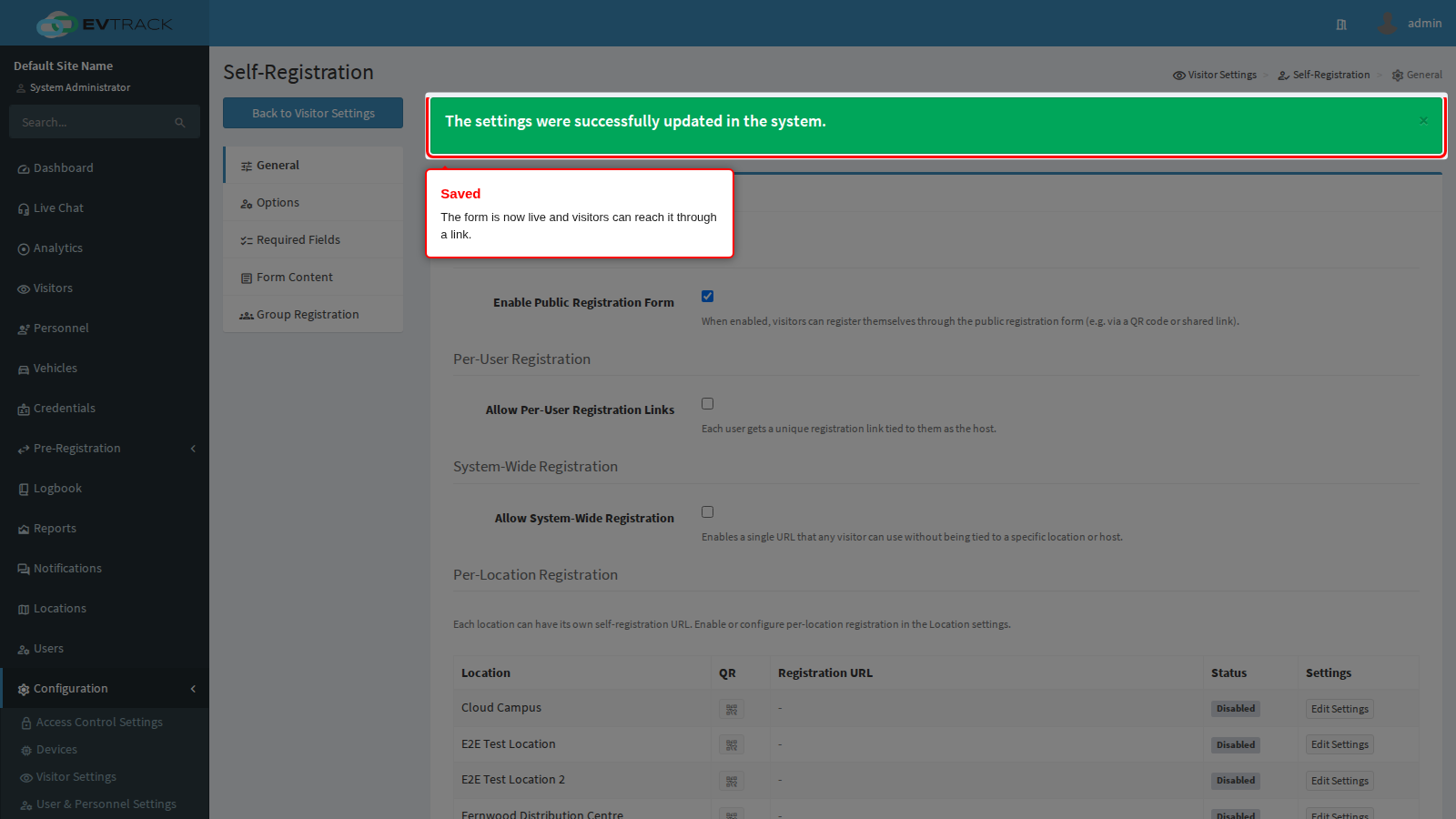
End state: the public registration form is live. Nobody can reach it yet, because no link has been produced; that is what the next two sections do.
Per-User Registration
A per-user link names the person who shared it as the host, so a visitor who registers through it is attributed to the right employee automatically. This is the option to use when hosts invite their own visitors.
Step 1: Switch per-user links on. Tick Allow Per-User Registration Links in the Per-User Registration section and save the tab.
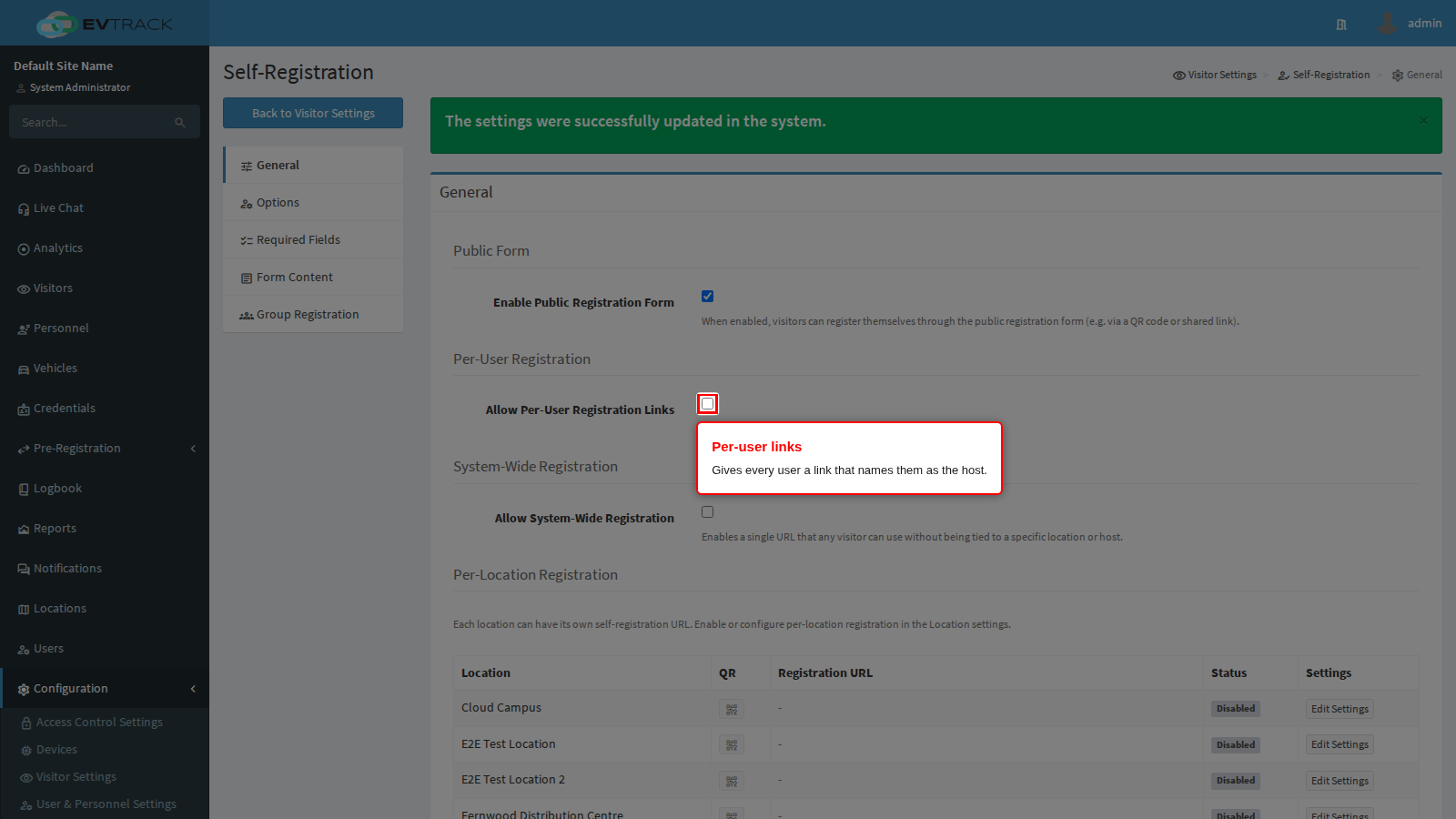
End state: the page reloads and a new Your Registration URL row has appeared underneath the toggle. It is not shown at all while the toggle is off.
Step 2: Copy your own link. The row shows the personal link for the account you are logged in as. Every user sees their own link here, so there is no central list to maintain.
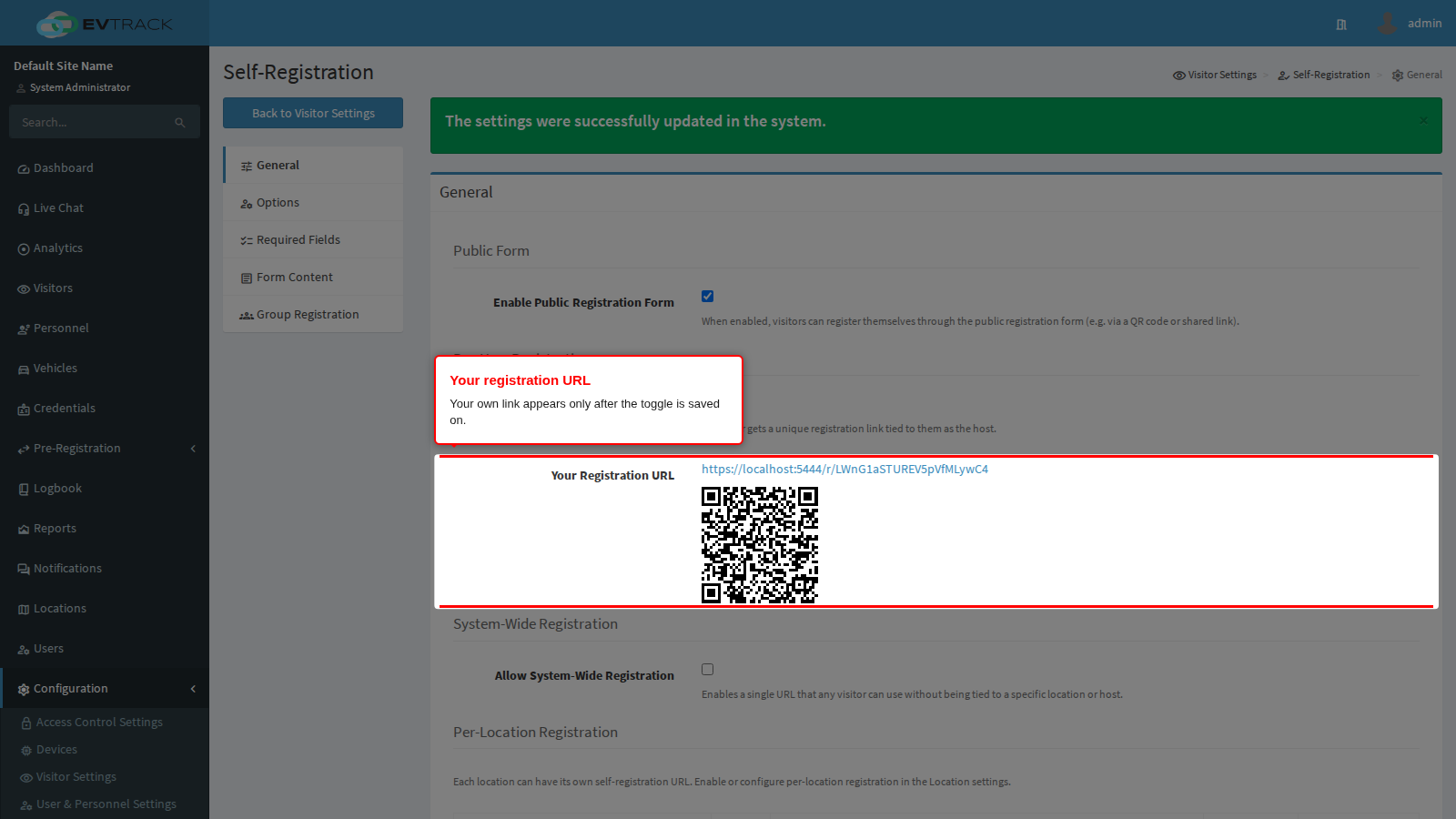
End state: you have a link that attributes any registration made through it to you.
Step 3: Use the QR code. Underneath the link is a scannable code for the same address, ready to print on a business card, a signature block or a desk sign.
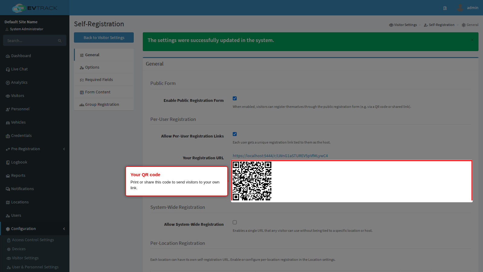
End state: a visitor who scans the code lands on the registration form with you already recorded as their host.
System-Wide Registration
One single link for the whole system, with no host and no location attached to it. Convenient, and deliberately guarded by a warning.
Step 1: Switch it on. Tick Allow System-Wide Registration in the System-Wide Registration section and save the tab.
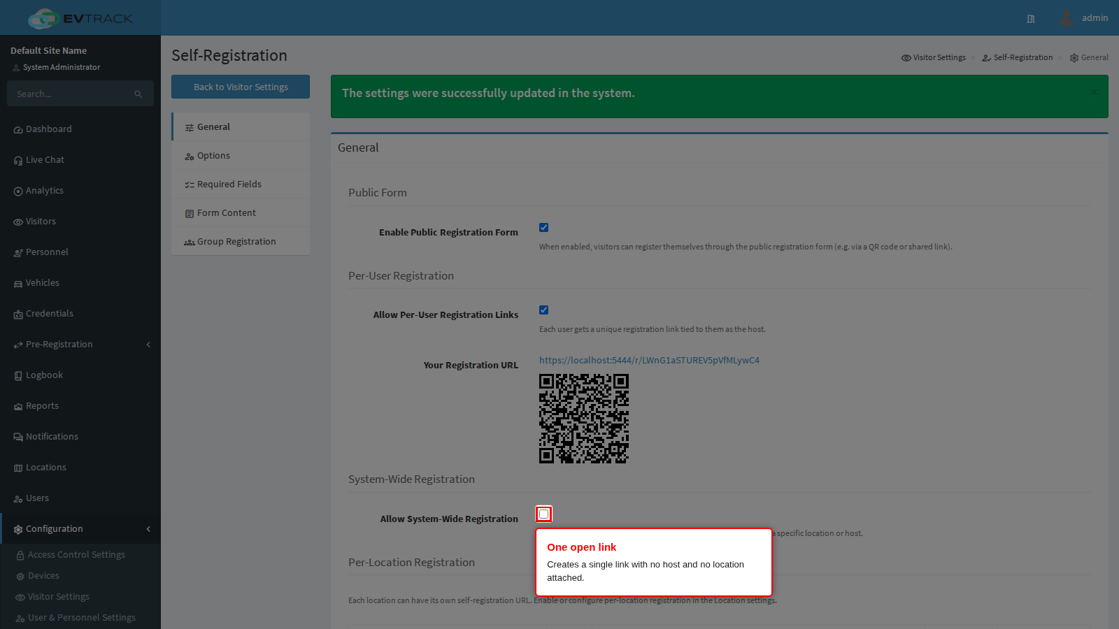
End state: the page reloads showing a warning and a new URL row, neither of which is shown while the toggle is off.
Step 2: Read the warning. Because the link carries no host and no location, anyone who has it can submit a registration. Treat it like a published address, not a private one.
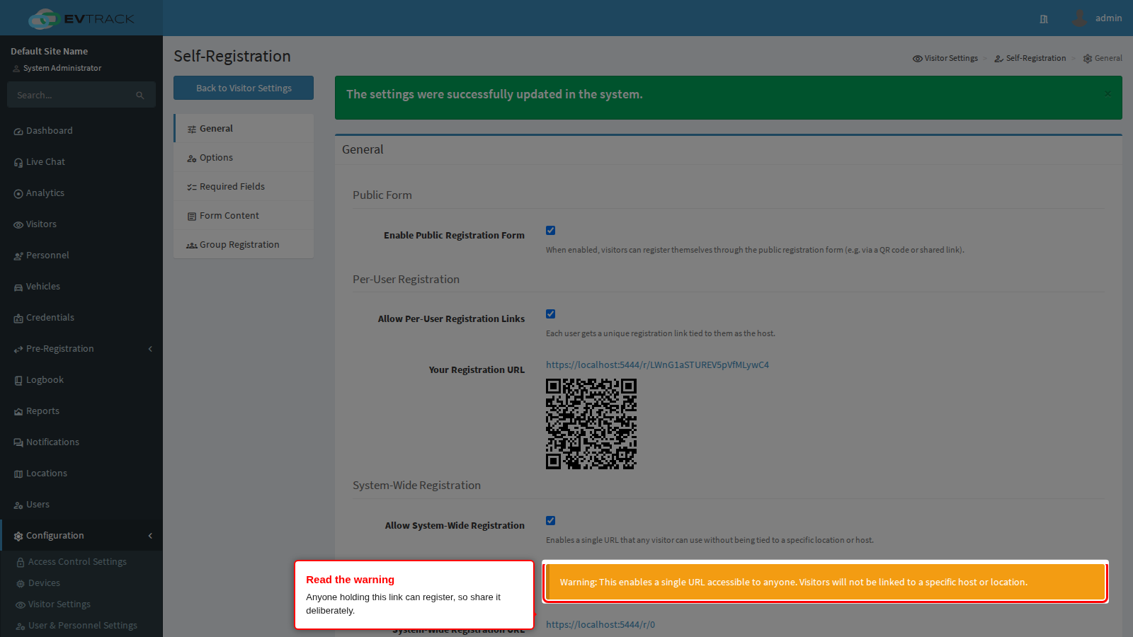
End state: you understand that the link is open to whoever holds it.
Step 3: Take the link and QR code. The System-Wide Registration URL row shows the single global address and its QR code.
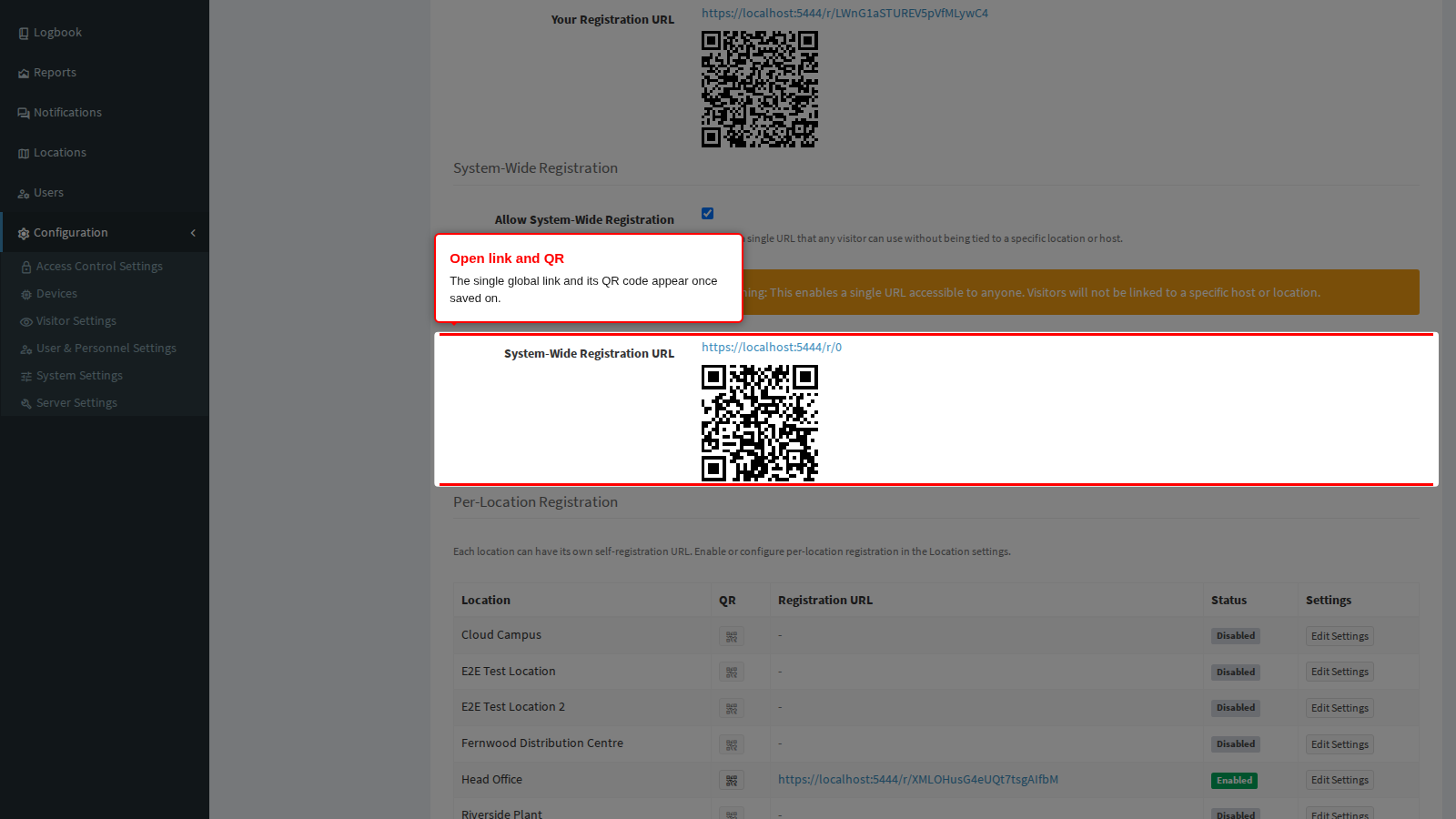
End state: you have one address that can be published anywhere. Requests arriving through it have no host, so they must be reviewed and assigned by an operator.
Per-Location Registration
Every location can carry its own registration link, so a visitor scanning the code at one entrance registers for that site. The table on this tab is a read-only summary; a location’s link is enabled and configured on the location itself.
Step 1: Read the table. Each row is one location, showing its name, a QR button, its registration link, an Enabled or Disabled status, and a shortcut to that location’s settings. A location with a Disabled status has no link yet.
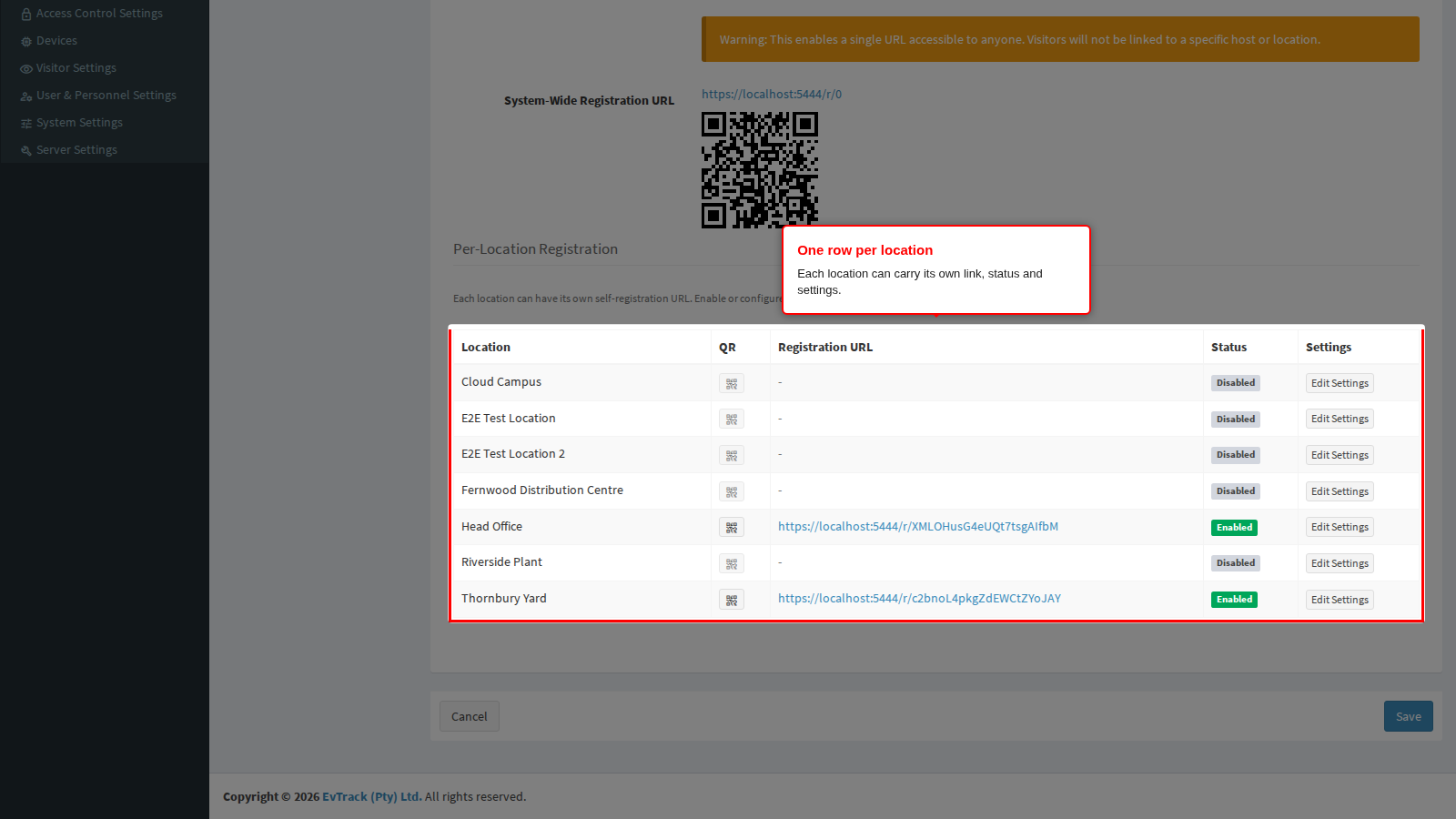
End state: you can see at a glance which sites accept self-registration.
Step 2: Show a location’s QR code. The button in the QR column opens a printable code for that location’s link. It is greyed out for locations that have no link.
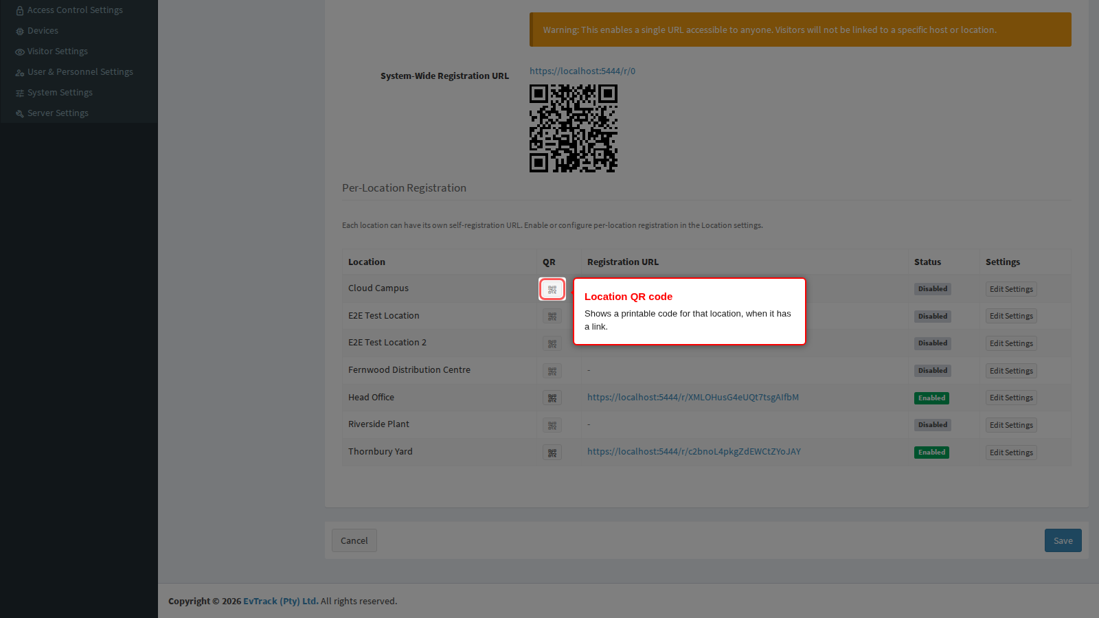
End state: you have a code that can be printed at that site’s entrance.
Step 3: Change a location’s settings. Edit Settings opens that location on its own self-registration tab, where the link is switched on and where a location may override the field requirements and the custom questions.
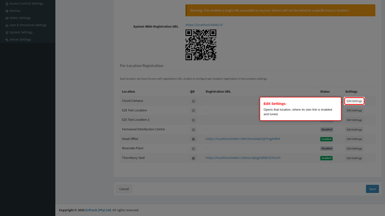
End state: you are on the location’s own configuration, which takes precedence over these system-wide settings for registrations made through that location’s link.
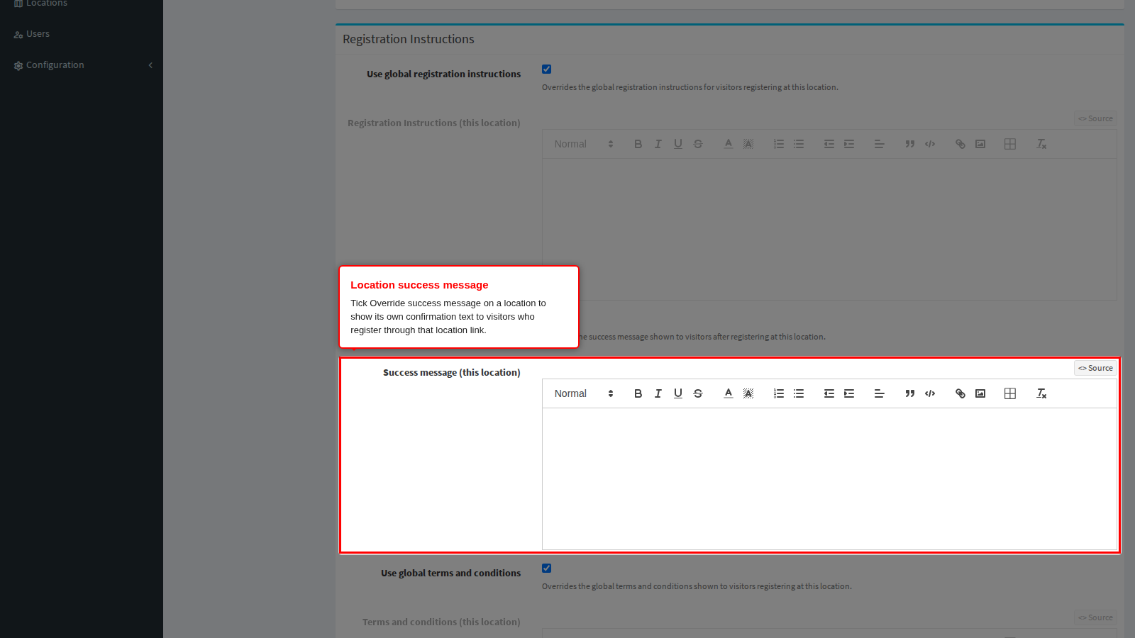
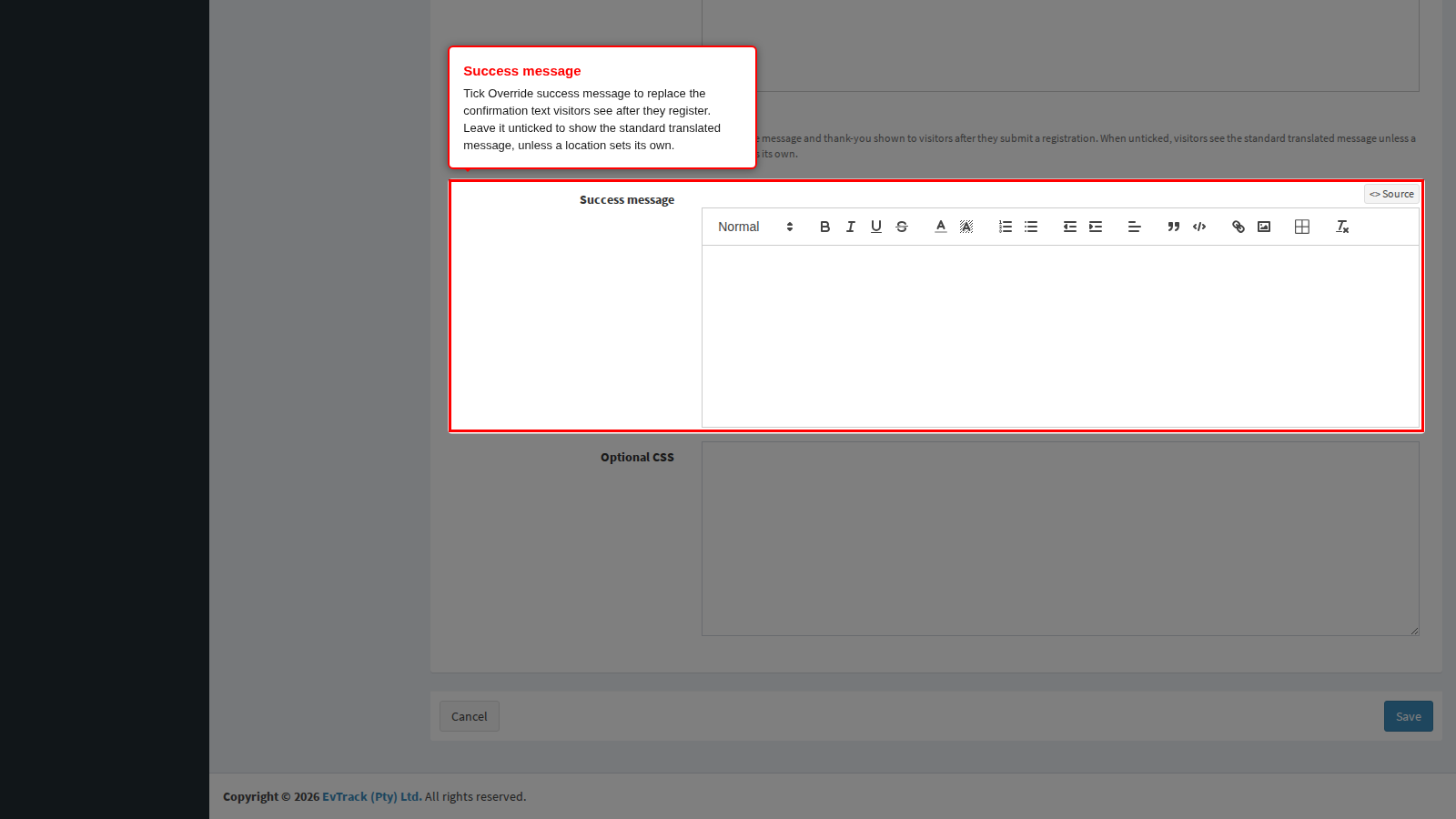
Each location can also show its own confirmation text. On the location’s Self-Registration tab, tick Override success message and write the message. Visitors who register through that location’s link see it, together with the location’s logo and company name. A location without its own message uses the global success message, and without either the standard translated message is shown.
How a location’s required fields reach the operator’s own form
A location’s required-field list does not only apply to its public link. It also decides what an operator is asked for on Add Visitor Registration, and the two questions - what you can see, and what you must fill in - are answered differently.
- What appears on the form. The operator sees the fields enabled system-wide, plus every field any location requires. That is deliberate: the location is chosen part-way down the form, so a field that only one site insists on still has to be on screen from the start. Otherwise the operator would be turned away for a box that was never there.
- What is mandatory. Only the location chosen on that form. A field showing no asterisk is optional for the location currently selected, not optional in general.
- The asterisks move when you change the location. Pick a different site and the mandatory markers update immediately, before anything is submitted.
- If the chosen location follows the system-wide list, nothing on that form is mandatory. This surprises people: the system-wide Required Fields tab governs which boxes appear there, not which ones must be completed.
Three different rules, depending on who is filling in the form. Worth keeping straight:
| Who is registering | Which list applies |
|---|---|
| A visitor using a location’s public link | That location’s list instead of the system-wide one |
| An operator on Add Visitor Registration | System-wide list plus every location’s, for what is shown; the chosen location alone for what is mandatory |
| An operator adding group members | Only the fields every active scope agrees on |
A worked example. Suppose Date of Birth is switched off system-wide, and only the Museum entrance requires it. Alexander Grant is registering a visitor: Date of Birth is on the form from the moment it opens, with no asterisk. Choose the Museum and the asterisk appears. Choose a different site and it goes away again. The visitor’s own public link for the Museum asks for it either way.
Options tab
The Options tab governs behaviour rather than content: what operators are asked to do with a registration, and which special cases the public form supports.
Step 1: Set how a location is chosen. Location selection when registering a visitor controls what the operator sees while processing a registration:
- Operator may choose (default) shows the location picker with an inherited default already selected.
- Operator must choose a specific location forces an explicit choice before the registration can be saved.
- Automatic (no operator choice) hides the picker and uses the operator’s own location, falling back to the location flagged as the default.
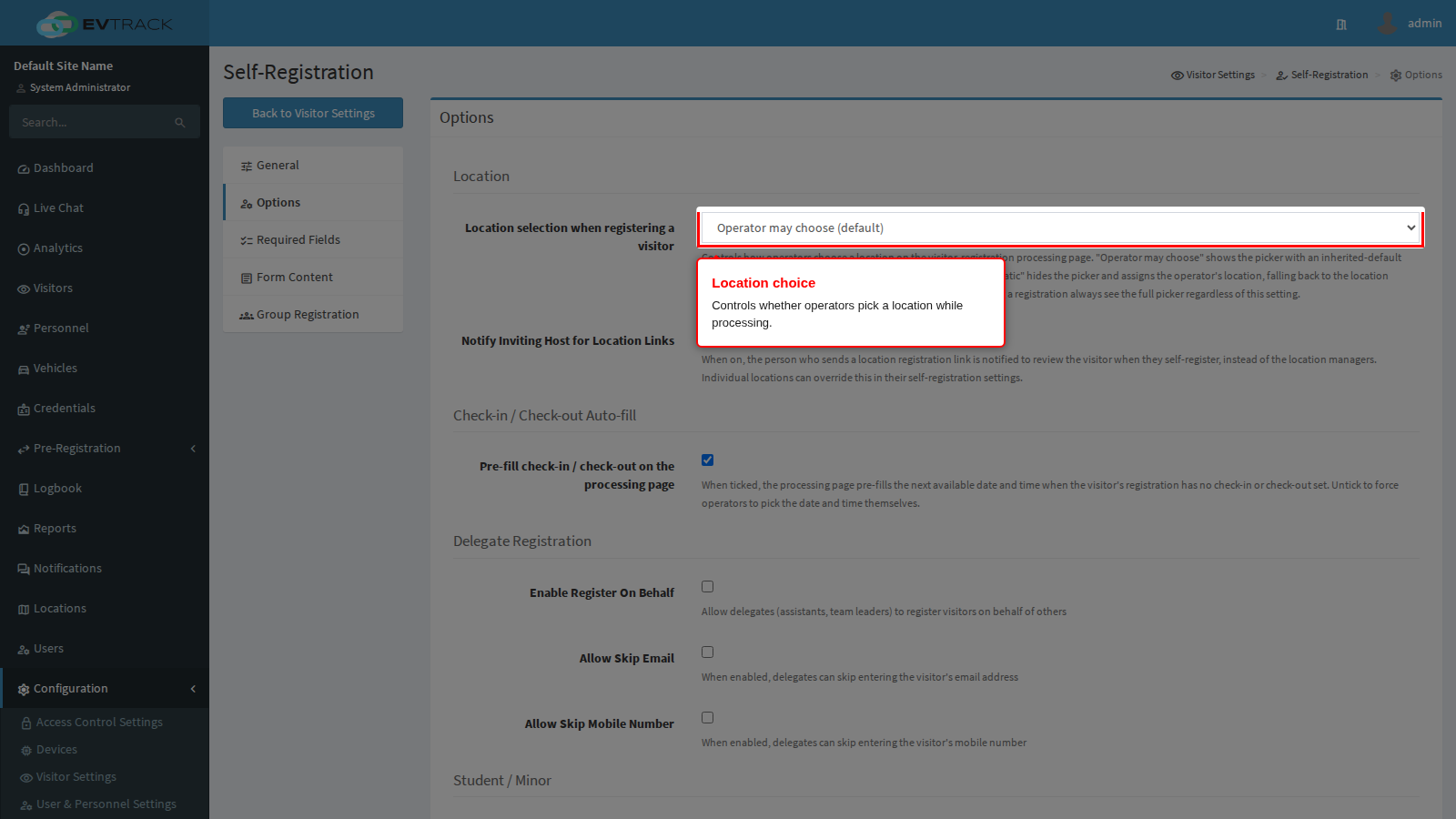
End state: operators either see a picker or they do not, consistently across the system.
The same section holds Notify Inviting Host for Location Links: when on, the person who shared a location link is notified to review the visitor instead of the location’s managers.
Step 2: Decide who may register on someone else’s behalf. Enable Register On Behalf lets assistants and team leaders submit a registration for another host. The two switches under it, Allow Skip Email and Allow Skip Mobile Number, let those delegates omit contact details the visitor may not have shared with them.
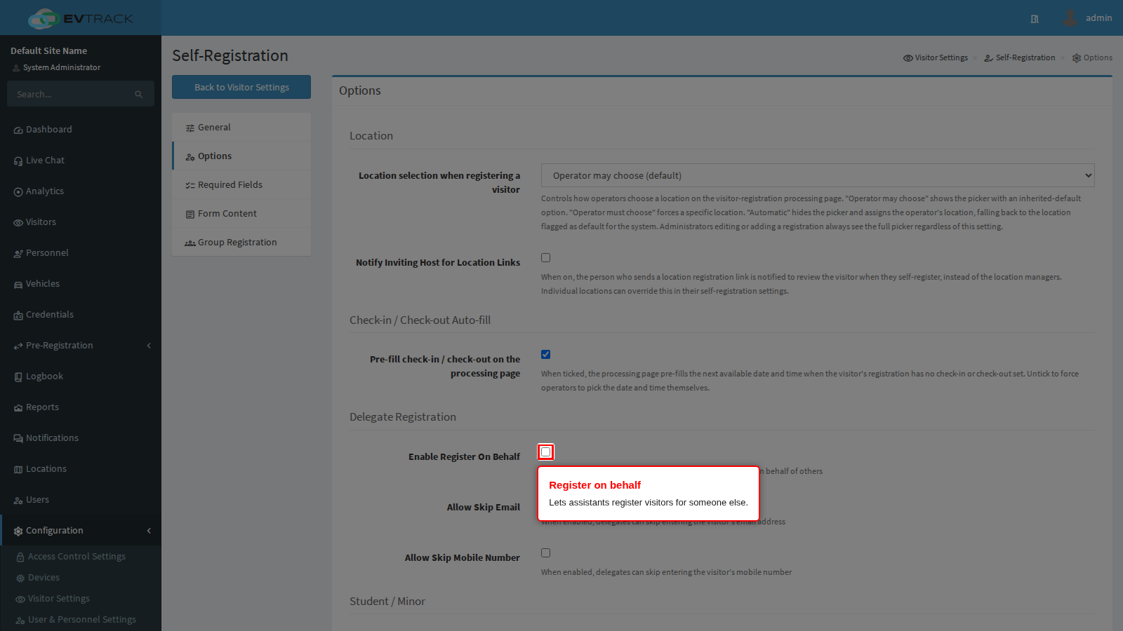
End state: delegates can act for colleagues, and you have decided how much contact detail they must supply.
Step 3: Allow students and minors. Allow Student/Minor Registration lets a visitor mark themselves as a student or minor and register without an ID or passport number. Minimum Age and Maximum Age bound who may use it; zero means no restriction on that end of the range.
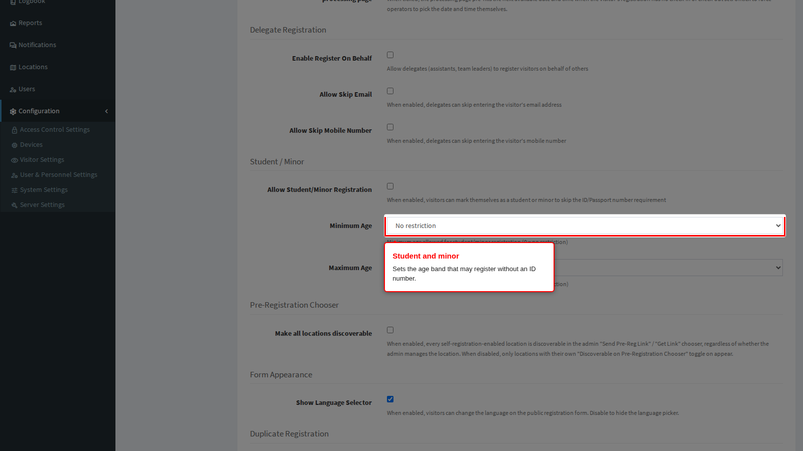
End state: young visitors can register without documents you do not expect them to carry.
Step 4: Tune the public form’s behaviour. Show Language Selector shows or hides the language picker on the public form. Two further settings live in this tab: Pre-fill check-in / check-out on the processing page, which fills the next available date and time when the visitor supplied none, and Make all locations discoverable, which decides whether every self-registration-enabled location appears in the link chooser or only the ones an operator manages. Max Concurrent Group Leader Registrations caps how many group registrations the same person may have awaiting approval at once.
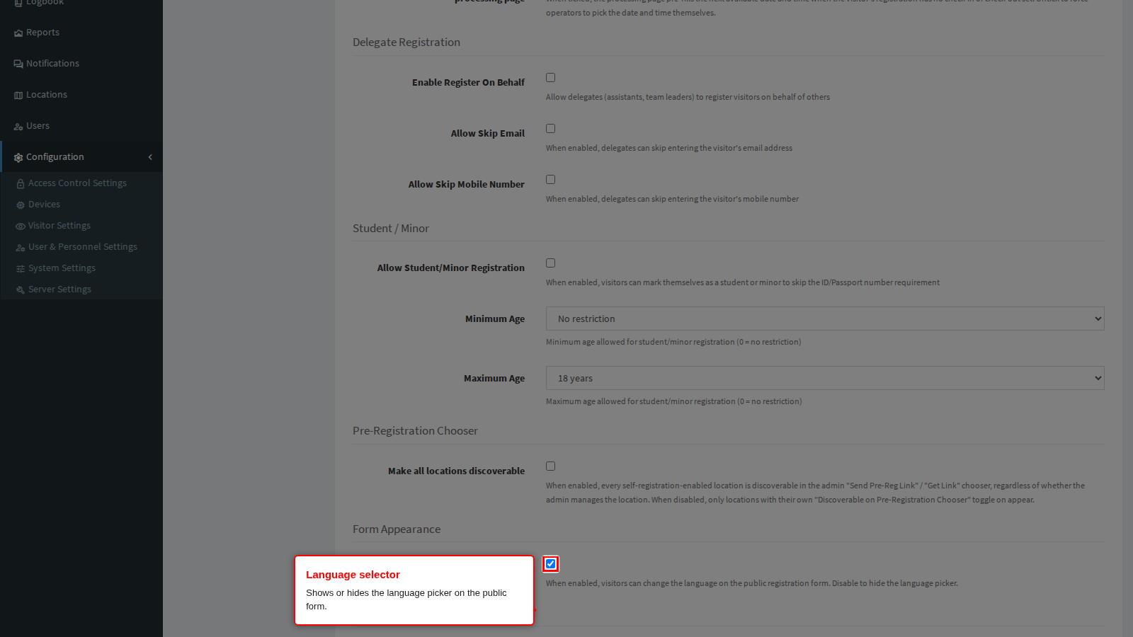
End state: the public form and the processing page behave the way your reception process expects.
Required Fields tab: the built-in fields
This tab has two halves. The upper half switches the product’s own fields on; the lower half, documented in the next section, adds your own questions.
Step 1: Review the whole list. The switches are grouped into Required Fields, Accessibility & Special Requirements, Parking Requirements, Vehicle Information, Legal Requirements and finally Custom Fields. A ticked box means the visitor must supply that detail before the form will submit; an unticked box means the field is not asked for.
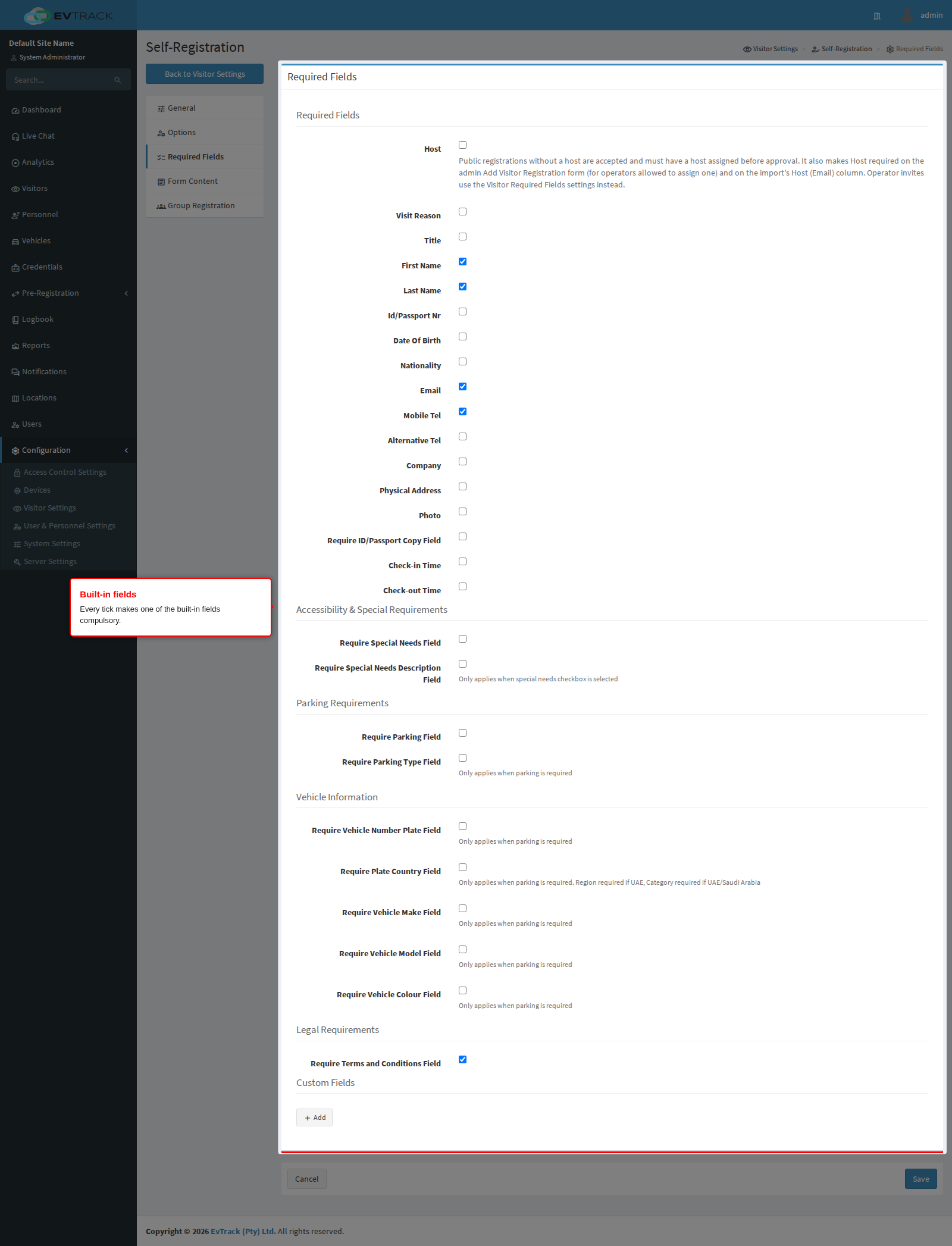
End state: you know which details the public form will insist on.
Step 2: Set the identity and contact details. The first group covers Host, Visit Reason, Title, First Name, Last Name, Id/Passport Nr, Date Of Birth, Nationality, Email, Mobile Tel, Alternative Tel, Company, Physical Address, Photo, Require ID/Passport Copy Field, Check-in Time and Check-out Time. Requiring Id/Passport Nr is what lets the system recognise a returning visitor rather than creating a duplicate.
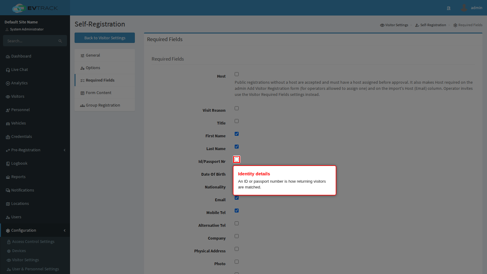
Host works differently from the rest of this list: the public form never asks a visitor to name their own host, so ticking it does not add a field there. Instead, a public registration submitted without a usable host is still accepted, then held until an operator assigns one on the processing page before the request can be approved. The same switch also makes Host mandatory on the admin console’s own Add Visitor Registration form, for an operator who is allowed to assign one. Operator invites use the Visitor Required Fields settings instead of this switch.
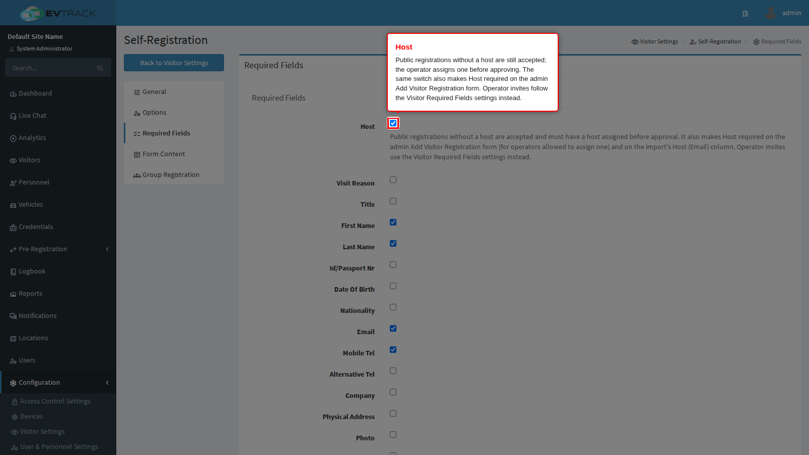
End state: the form collects enough to identify the visitor and contact them. If Host is ticked, a request that arrives with no usable host is held for one instead of failing outright.
Step 3: Set parking and vehicle details. Require Parking Field and Require Parking Type Field ask whether the visitor needs a bay and which kind. The vehicle group adds Require Vehicle Number Plate Field, Require Plate Country Field, Require Vehicle Make Field, Require Vehicle Model Field and Require Vehicle Colour Field. The vehicle colour and related details only apply when parking is requested.
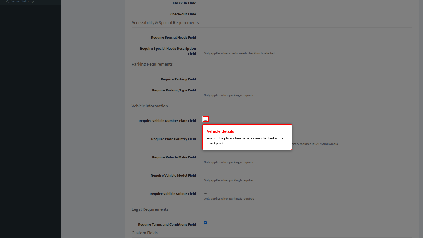
End state: drivers are asked for their vehicle, and walk-in visitors are not.
Step 4: Set the accessibility and legal questions. The accessibility group asks whether the visitor has special requirements and, optionally, a description; the wording of those two labels follows the accessibility terminology configured for your system. Require Terms and Conditions Field forces the visitor to accept the terms text, which you write on the Form Content tab.
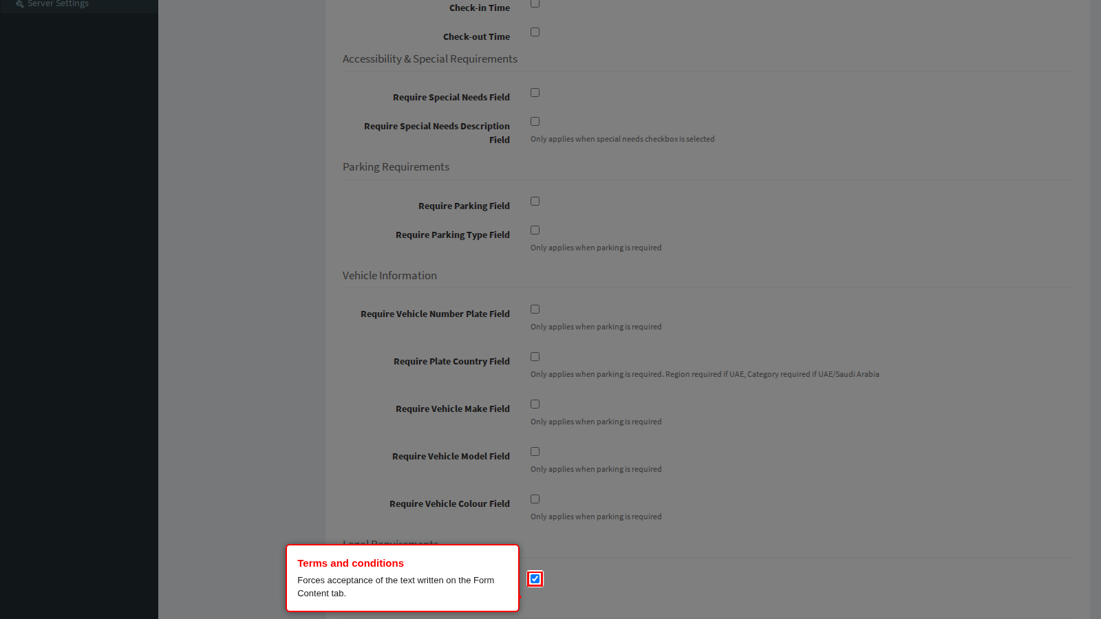
End state: the form meets your legal and accessibility obligations. Click Save to apply the tab.
These switches apply to the public self-registration form. The separate Required Fields page under Visitor Settings governs what operators must capture in the admin console. They are different screens with different audiences.
Required Fields tab: custom fields
Custom fields are your own questions. Each one has a type, a label and a required flag; questions with a list of choices also carry the values to choose from. Everything you define appears on the public form underneath the built-in fields, in the order shown here.
The builder sits at the very bottom of the Required Fields tab, under the Custom Fields heading. On a system that has never used it, it is just an Add button.
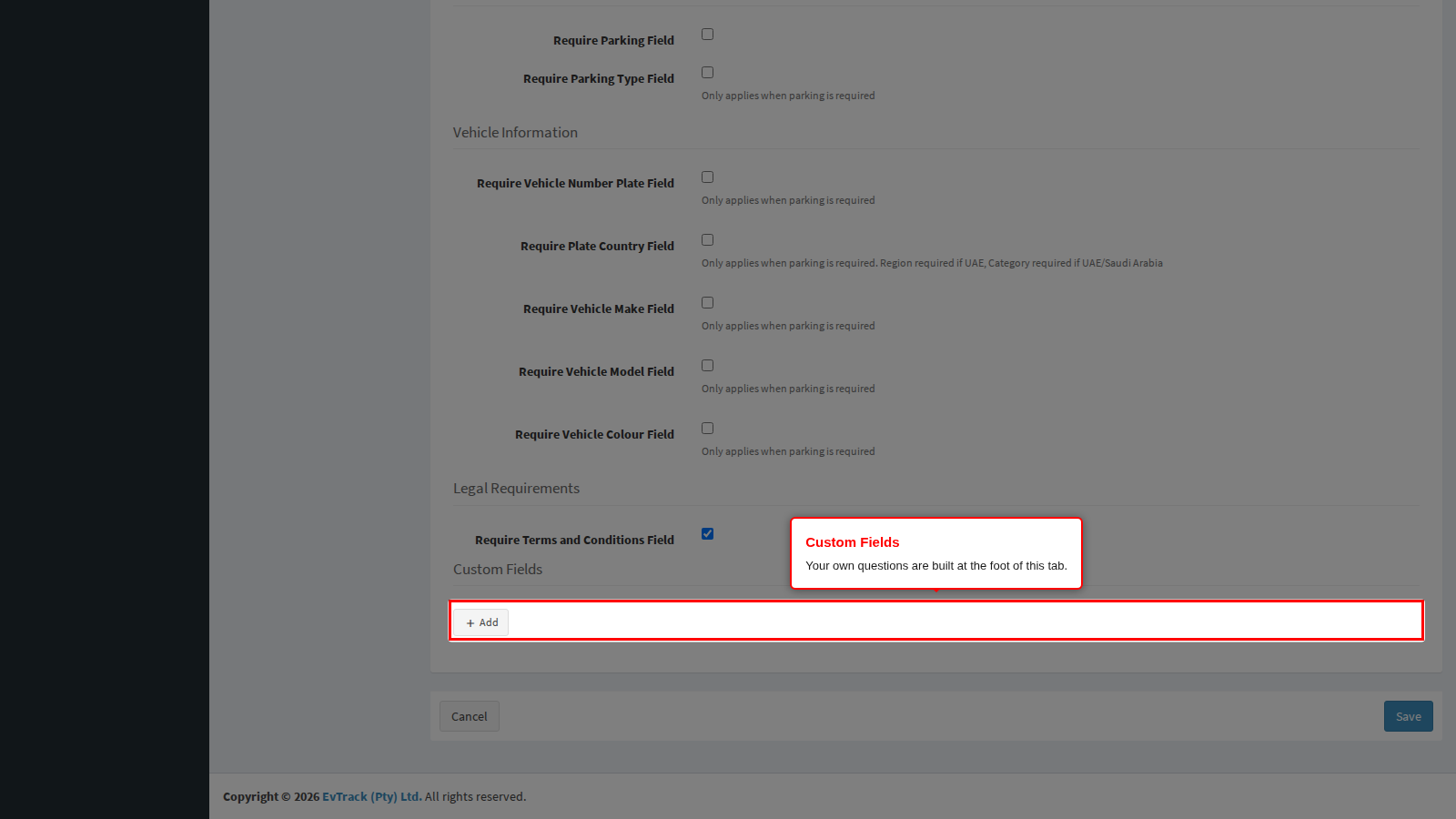
Step 1: Add a question. Click Add.
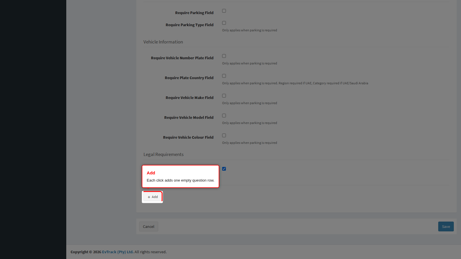
End state: an empty row appears with a Type list, a Custom Field Label box, an Is Field Always Required? tick box and a row of small buttons on the right.
Step 2: Choose the type. Open the Type list and pick what you want to collect.
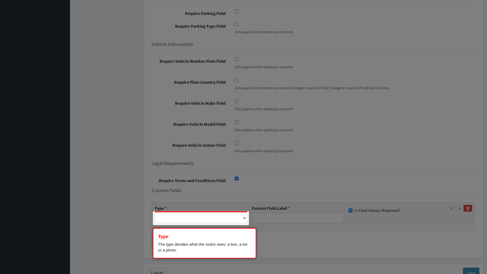
The types offered on the visitor self-registration form are:
| Type | What the visitor sees | Use it for |
|---|---|---|
| Text Field | A single-line box | Short free text: a permit number, a purchase order reference |
| Number | A box that accepts numbers only | Counts and reference numbers |
| Photo | An upload panel that accepts images | A picture of a delivery, a vehicle or equipment |
| Drop Down | A list of values, one answer allowed | A single choice: area to be visited, contractor category |
| Checkboxes | A list of values, several answers allowed | Several choices: inductions completed, equipment carried |
| Text Area | A multi-line box | Longer free text: a description or a reason |
Always pick a type. A question saved with a label but no type is stored and then never rendered, so nobody can answer it.
End state: the row shows the chosen type, and for Drop Down and Checkboxes a Values list appears further down the row.
Step 3: Label the question and decide whether it is mandatory. Type the wording the visitor should read into Custom Field Label. It is the only text they see, so phrase it as a question or a clear instruction.
Is Field Always Required? is ticked by default. Leave it ticked to force an answer; untick it to make the question optional. A required question is enforced both on the public form and again when an operator saves the registration, so an unanswered mandatory question cannot slip through.
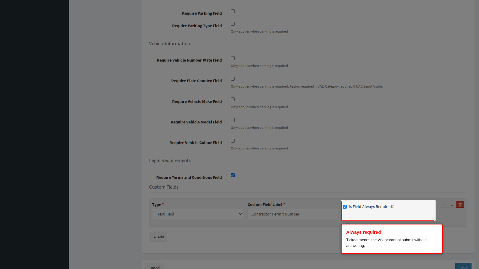
End state: the row reads as a finished question: type, label and required flag.
Step 4: Define the values of a choice question. Add a second question, set its type to Drop Down (or Checkboxes), and label it. A Values list appears. Click its Add button once per choice and type the choice into the box.
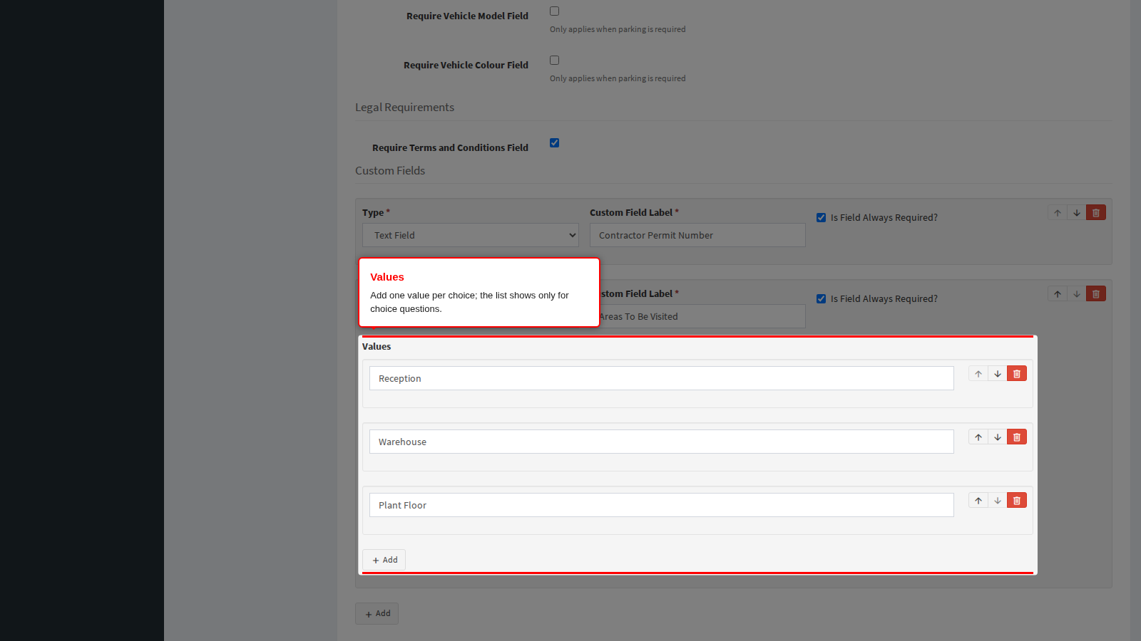
- The values are shown to the visitor exactly as typed, in the order listed.
- Blank value boxes are discarded when you save, so an accidental empty row is harmless.
- The list is hidden for every other type. Changing a question from Drop Down to Text Field hides it again.
End state: the choice question lists every value the visitor will be offered.
Step 5: Reorder or remove a question. Every row carries its own small buttons on the right: Move up and Move down change the order the visitor answers them in, and the red Remove button deletes the question. A row left with no label at all is dropped when you save, which is the quickest way to abandon a row started by mistake.
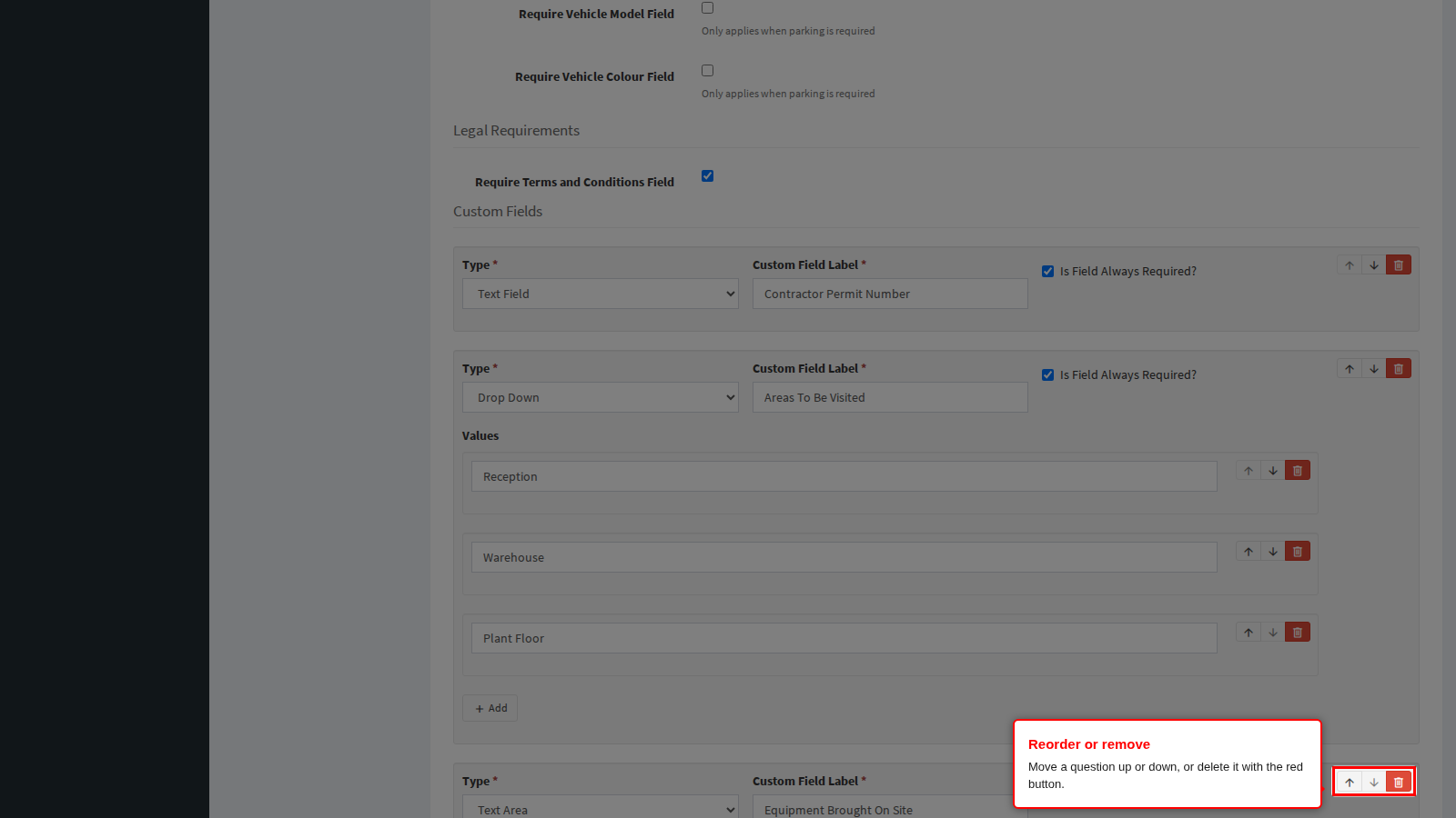
End state: the questions are in the order visitors will meet them.
Step 6: Save. The builder has no save button of its own. Click Save at the bottom of the Required Fields tab to store the built-in switches and the custom questions together, then reload the page to confirm the questions come back in their stored order.
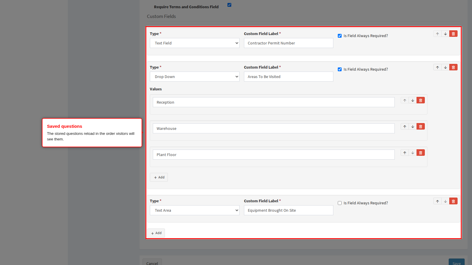
End state: a green confirmation is shown and the questions are live on the public form.
Step 7: See where the answers land. The same questions appear in an Additional Fields panel on the visitor registration an operator captures or reviews in the admin console, so an operator can complete or correct them. Answers submitted by the visitor are shown there, and on the registration’s processing page under Additional Information, where photo answers are shown as a picture with a download button and file answers as a download link.
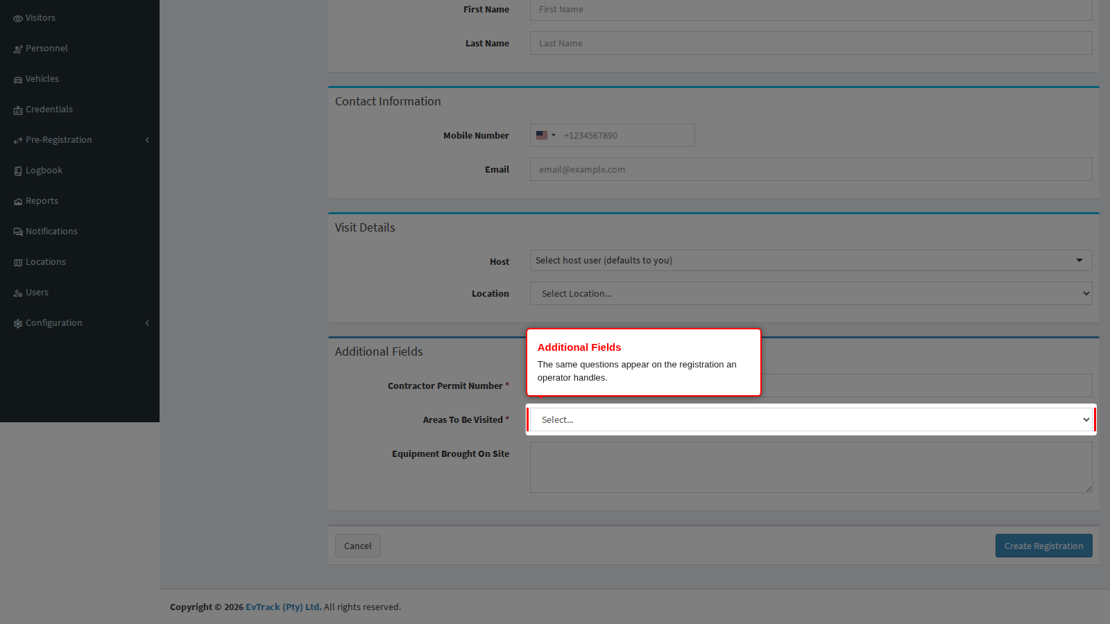
End state: every answer a visitor gave is visible to the operator who approves the visit.
A location can override the list. If a location defines its own custom fields on its self-registration settings, registrations arriving through that location’s link ask those questions instead of the system-wide list, not in addition to them. Leave a location’s custom fields empty to inherit the questions defined here.
Custom fields elsewhere in the product
The same builder appears on several screens, but each one offers the types that make sense where it is used. A question defined on one screen never appears on another.
| Screen | Types offered | Value lists |
|---|---|---|
| Visitor Settings > Self-Registration > Required Fields (this page) | Text Field, Number, Photo, Drop Down, Checkboxes, Text Area | Drop Down and Checkboxes |
| Visitor Settings > Kiosk > Fields | Text, Number, Temperature, Photo, Drop-down List | Drop-down List only |
| Visitor Settings > Guard App > Fields | Text, Number, Temperature, Photo, Drop-down List | Drop-down List only |
| Visitor Settings > Guard App > Access Control | Text, Number, Photo | None |
| User & Personnel Settings > Self-Registration > Fields | Text Field, Number, Photo, File, Drop Down, Checkboxes, Text Area | Drop Down and Checkboxes |
Two differences are worth remembering. The kiosk and guard app add a Temperature type, for capturing a reading as someone arrives, which the public form does not offer. Only the user and personnel form offers a File type for document uploads; visitor questions upload images only. Full details for the other screens are in Kiosk, Guard App and User Registration Fields.
Form Content tab
This tab holds the words and the look of the public form. Nothing here changes what is collected, only what the visitor reads.
Step 1: Write the instructions. Registration Instructions is shown at the top of the public form. Use it to say who the form is for, what the visitor should have ready, and who to contact if they get stuck. The editor supports basic formatting.
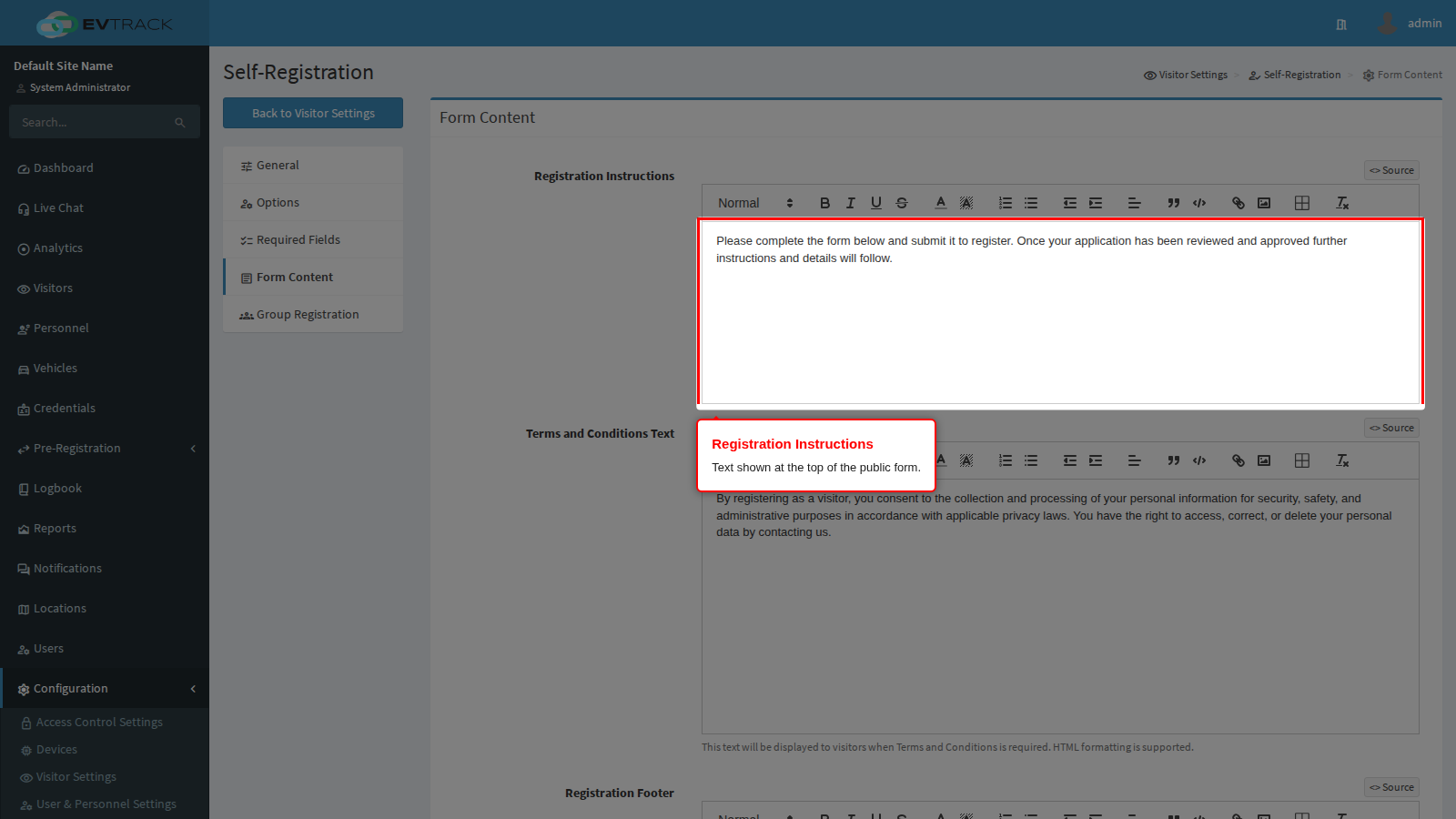
End state: visitors arriving on the form know what is expected of them.
Step 2: Write the terms and conditions. Terms and Conditions Text is the wording a visitor accepts when Require Terms and Conditions Field is ticked on the Required Fields tab. If that switch is off, this text is never shown.
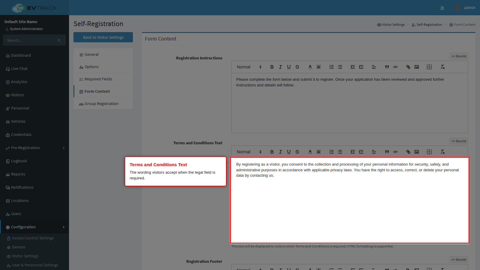
End state: the acceptance box on the form has something meaningful behind it.
Step 3: Add a footer and any styling. Registration Footer appears at the bottom of the form, which suits contact details or a privacy note. Optional CSS lets you adjust colours and spacing; leave it blank to keep the default appearance.
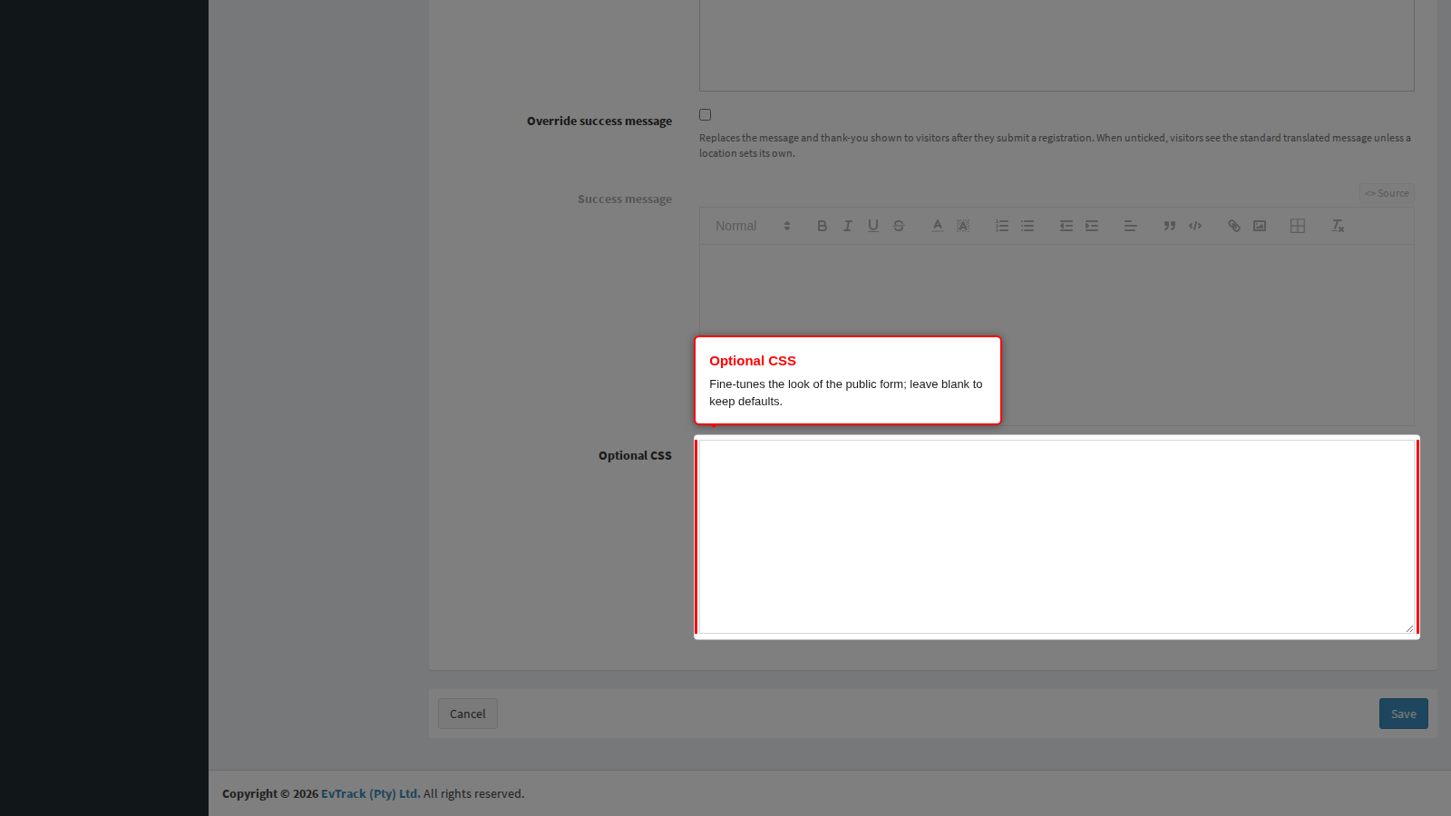
End state: the public form reads and looks like part of your own site. Click Save to apply the tab.
Success message
After a visitor submits a registration, the confirmation page shows a translated standard message. To show your own text instead, tick Override success message and write the message in the editor. The heading remains translated. Unticking the box keeps your text so you can switch it back on later. A location that sets its own success message shows that message instead, whether or not this box is ticked.
Group Registration tab
Group registration lets one person book several visitors in a single submission, for example a school outing or a contractor crew.
Step 1: Switch group registration on. Enable Group Registration allows a representative to register a group through the public form. While it is off, every registration is for a single visitor.
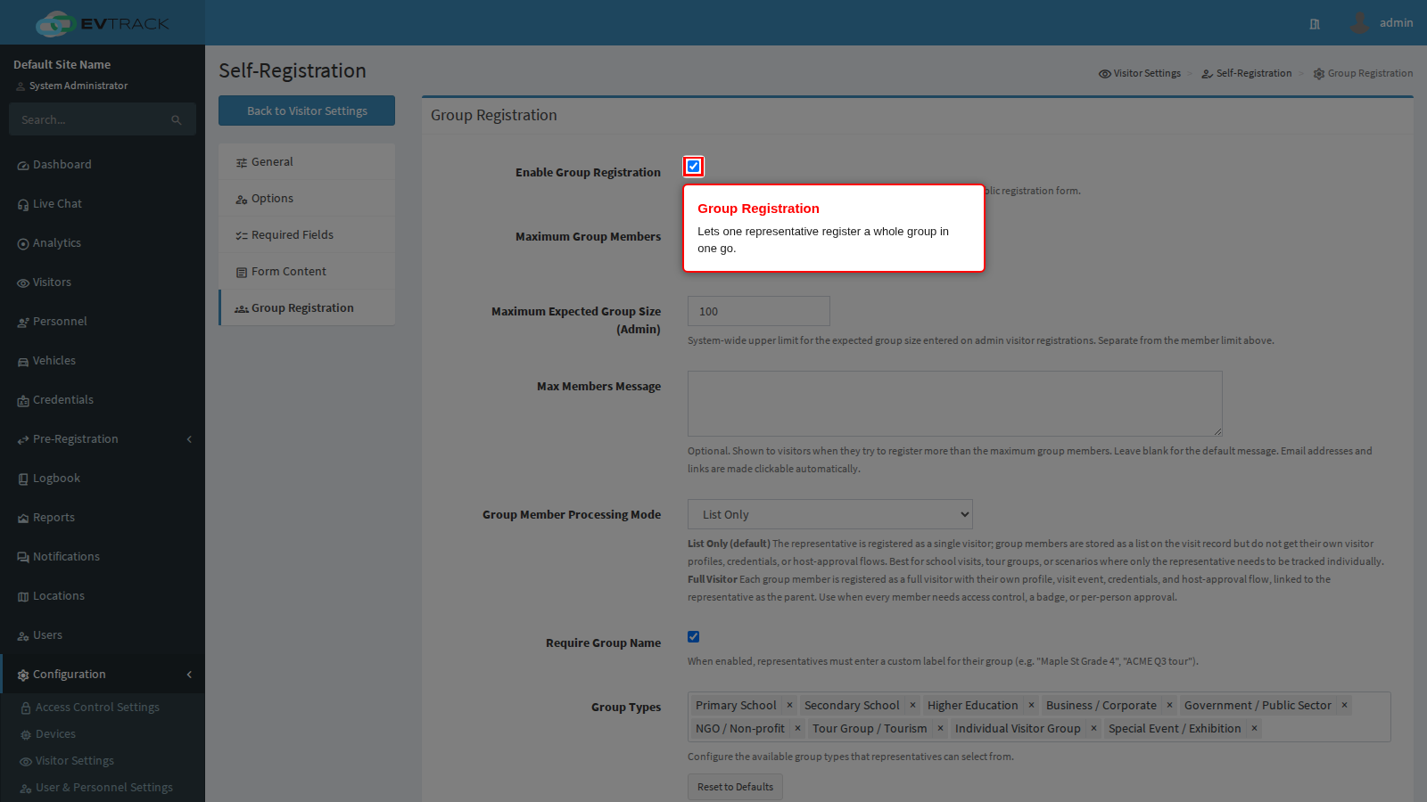
End state: the public form offers a group option.
Step 2: Set the limits. Maximum Group Members caps how many members one group registration may carry. Maximum Expected Group Size (Admin) is a separate upper limit for the expected size an operator types on an admin registration. Max Members Message is optional text shown to a representative who tries to exceed the member limit; leave it blank for the default wording.
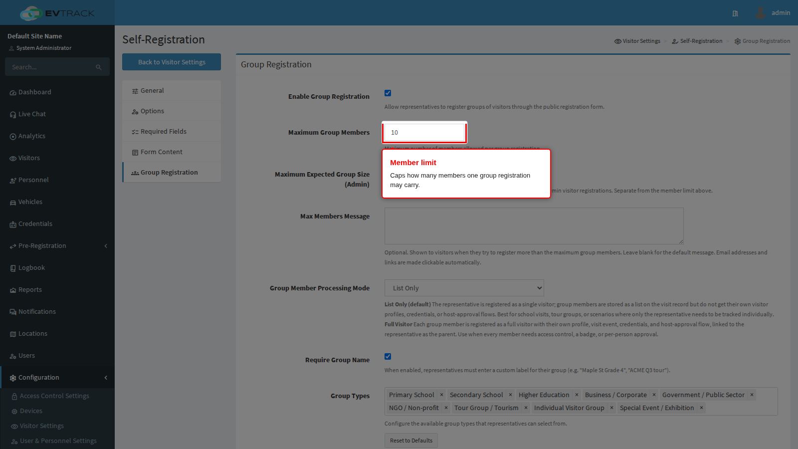
End state: group registrations cannot grow beyond what your site can handle.
Step 3: Decide how members are processed. Group Member Processing Mode is the most consequential setting on this tab:
- List Only (default) registers the representative as a single visitor. Members are stored as a list on the visit record and do not get their own profiles, credentials or host approval.
- Full Visitor registers every member as a visitor in their own right, with a profile, a visit, credentials and host approval, linked to the representative.
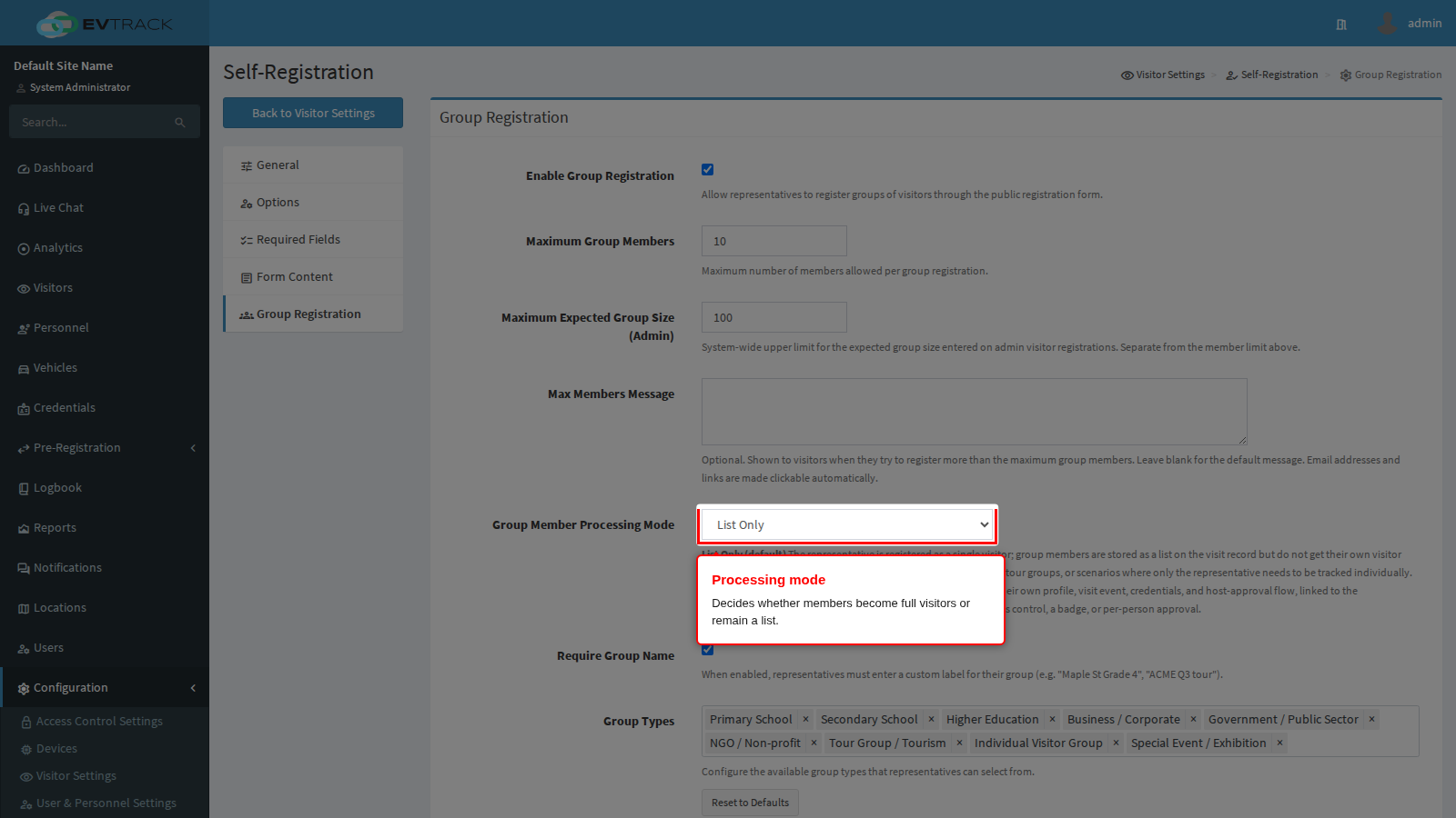
Two further settings complete the tab: Require Group Name forces the representative to name their group, and Group Types defines the categories they can pick from, with a Reset to Defaults button to restore the supplied list.
End state: groups are captured at the level of detail your access control needs. Click Save to apply the tab.
Related pages
- Required Fields for what operators must capture in the admin console, which is a separate policy from the public form.
- Visitor Self-Registration to see the public form end to end, from the visitor’s side.
- Visitor Registration for sharing the link and processing the requests that arrive.
- Group Pre-Registration for the group registration flow in practice.
- User Registration Fields for the equivalent settings and custom-field builder used by staff and contractor self-registration.
See also: Group Pre-Registration for the visitor-facing flow, and Managing Group Registrations (Admin) for building and processing a group from the admin panel.